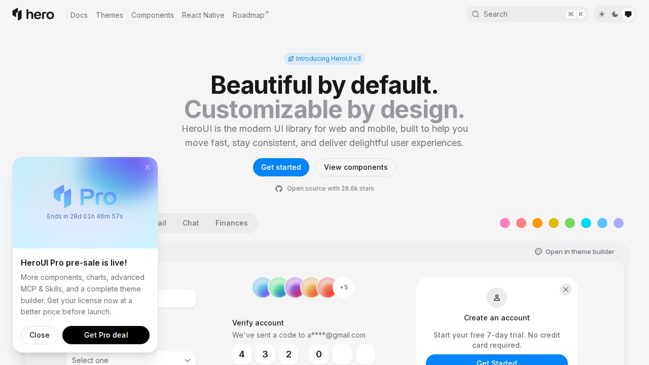
HeroUI
Modern UI library for web & mobile
Freemium
Support platforms
web
What is HeroUI
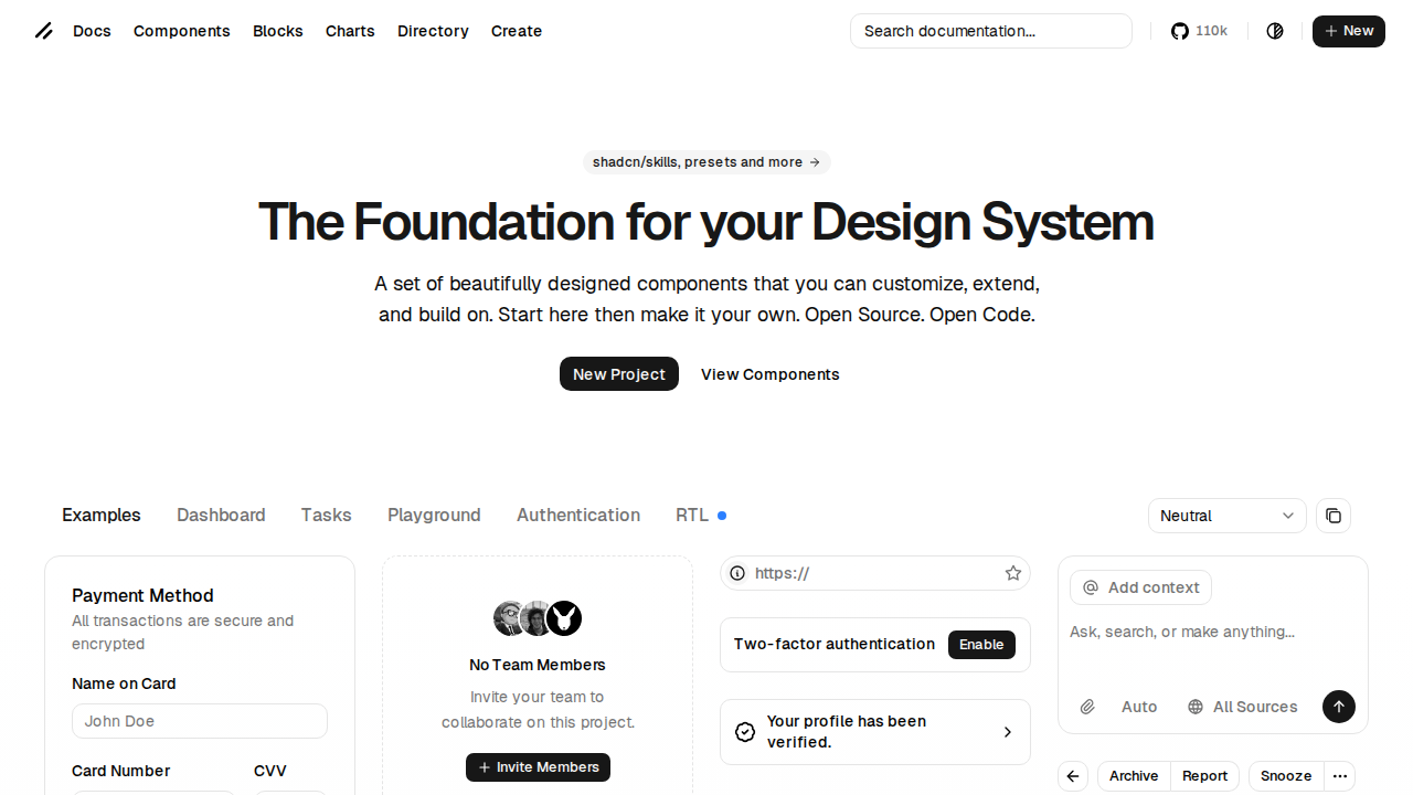
HeroUI (formerly NextUI) is a modern UI library designed for web and mobile development, focusing on speed, consistency, and delightful user experiences. It provides a collection of pre-built, customizable components that adhere to modern design principles, enabling developers to build visually appealing and functional interfaces rapidly. HeroUI distinguishes itself through its focus on beautiful defaults and extensive customization options, allowing for a high degree of design flexibility without sacrificing development efficiency. It leverages a component-based architecture, making it easy to integrate and maintain. Developers, designers, and teams looking to accelerate UI development and maintain a consistent design language across projects will find HeroUI highly beneficial.
HeroUI 's Core features
Beautiful by Default
HeroUI components are designed with a focus on aesthetics, providing a visually appealing user experience out-of-the-box. This reduces the need for extensive initial styling, allowing developers to focus on functionality. The default styles are modern and clean, ensuring a polished look without requiring significant customization efforts. This accelerates the development process and ensures a consistent visual style across your application.
Customizable by Design
HeroUI offers extensive customization options, allowing developers to tailor components to their specific design needs. This includes theming support, allowing you to easily switch between light and dark modes, as well as the ability to override default styles using CSS variables. This flexibility ensures that HeroUI components can seamlessly integrate into any project, regardless of its existing design system or branding guidelines.
React and React Native Support
HeroUI provides components specifically designed for both React and React Native, enabling developers to build consistent UIs across web and mobile platforms. The components are optimized for performance and ease of use in their respective environments. This cross-platform compatibility streamlines development workflows and reduces the effort required to maintain a unified user experience.
Open Source with 27.7k Stars
HeroUI is an open-source project with a large and active community, indicated by its high number of GitHub stars. This means that the library is continuously improved and maintained by a community of developers, ensuring that it remains up-to-date with the latest web development trends and best practices. The open-source nature also allows for greater transparency and community contributions.
Theme Builder
HeroUI offers a theme builder tool that allows developers to visually customize the appearance of their components. This tool simplifies the process of creating custom themes, allowing you to easily adjust colors, fonts, and other visual elements. The theme builder provides a user-friendly interface for creating and previewing themes, enabling you to quickly iterate on your design and ensure a consistent look and feel across your application.
How to use HeroUI
- Visit the HeroUI website and explore the documentation and component library.,2. Choose your preferred framework (React, React Native).,3. Install the HeroUI package using npm or yarn:
npm install @hero-ui/reactoryarn add @hero-ui/react.,4. Import and use components in your project:import { Button } from '@hero-ui/react';,5. Customize components using the provided props and theming options to match your design requirements.,6. Explore the HeroUI Pro features for advanced templates and components.
Use cases of HeroUI
Building Web Applications
Web developers can use HeroUI to quickly build modern and responsive web applications. They can leverage pre-built components like buttons, forms, and navigation bars to accelerate development. This allows developers to focus on the core functionality of their application rather than spending time on UI design and implementation, resulting in faster time-to-market.
Developing Mobile Apps
React Native developers can use HeroUI to create consistent and visually appealing mobile applications. The library provides components optimized for mobile devices, ensuring a smooth and responsive user experience. This helps developers create native-like mobile apps with a consistent design language across both iOS and Android platforms.
Creating Design Systems
Designers and developers can use HeroUI to establish a consistent design system across multiple projects. By customizing the components and creating a custom theme, teams can ensure that all applications share a unified visual identity. This improves brand consistency and simplifies the process of maintaining and updating the UI across different projects.
Prototyping and Rapid Development
Teams can use HeroUI to rapidly prototype and develop user interfaces. The pre-built components and customization options allow for quick iteration and experimentation. This is particularly useful for startups and projects where speed and agility are critical. The ability to quickly build and test UI elements accelerates the development cycle.
Who benefits from HeroUI
Front-End Developers
Front-end developers benefit from HeroUI by accelerating UI development, reducing boilerplate code, and ensuring consistent styling. They can quickly integrate pre-built components and customize them to fit project requirements, saving time and effort on UI implementation.
React and React Native Developers
React and React Native developers gain access to a library of optimized components specifically designed for their frameworks. This streamlines the development process, ensures cross-platform consistency, and allows them to build visually appealing and responsive user interfaces more efficiently.
UI/UX Designers
UI/UX designers can use HeroUI to quickly translate their designs into functional components. The library's focus on customization and theming allows designers to easily implement their design vision. They can collaborate more effectively with developers and ensure that the final product aligns with their design specifications.
Startups and Small Businesses
Startups and small businesses can leverage HeroUI to build professional-looking applications quickly and cost-effectively. The library's ease of use and pre-built components reduce development time and allow them to focus on their core business logic.
Pricing of HeroUI
Open source (MIT License). HeroUI Pro offers additional features and templates. Pricing not explicitly stated on the landing page, but a 'Get a paid plan' option exists. Trial available.