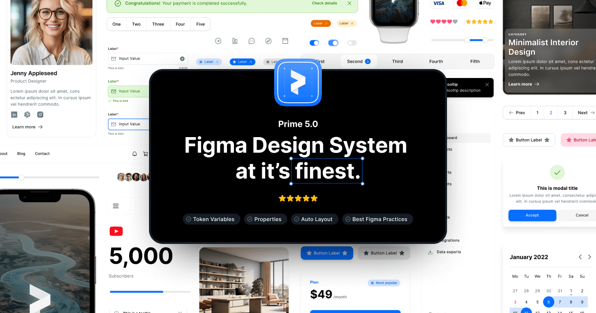
Prime Design System Kit
Figma Design System Kit
Paid
Support platforms
web
What is Prime Design System Kit
Prime Design System Kit is a comprehensive UI component library and design architecture built specifically for Figma. It streamlines the design-to-development workflow by providing a robust set of atomic design elements, including typography scales, color palettes, and interactive components. Unlike generic UI kits, Prime focuses on strict adherence to design tokens, allowing teams to maintain consistency across large-scale digital products. It leverages Figma’s advanced features like Auto Layout, variants, and component properties to ensure high fidelity and responsiveness. This kit is ideal for product designers, design systems leads, and frontend developers who need to reduce design debt and accelerate the prototyping phase of complex web and mobile applications.
Prime Design System Kit 's Core features
Atomic Design Architecture
The kit is structured using the Atomic Design methodology, breaking down interfaces into atoms, molecules, and organisms. This modular approach allows for high reusability and easier maintenance. By updating a single atom—such as a button style or color token—changes propagate automatically across all dependent molecules and organisms, significantly reducing manual updates and ensuring visual consistency across hundreds of screens.
Advanced Auto Layout Integration
Every component is built using Figma’s Auto Layout, ensuring that elements respond dynamically to content changes. This eliminates the need for manual resizing when text strings vary in length or when adding new items to a list. This responsiveness mimics real-world CSS Flexbox behavior, providing developers with a clearer understanding of how components should behave in the final coded implementation.
Comprehensive Token System
Prime utilizes a centralized design token system for colors, spacing, typography, and shadows. By decoupling design values from specific elements, teams can easily implement theming, such as dark mode or brand-specific variations, without rebuilding components. These tokens are designed to map directly to CSS variables or SCSS/Tailwind configurations, bridging the gap between design and production code.
Interactive Component Variants
The kit includes a full suite of component variants, covering states like hover, active, disabled, and focus. These are managed through Figma’s variant properties, allowing designers to toggle states directly within the design canvas. This reduces the total number of master components in the library, keeping the file lightweight and easier to navigate while providing a realistic prototyping experience.
Developer-Ready Handoff Specs
Each component is meticulously named and organized to align with standard frontend naming conventions. The kit includes documentation on spacing, padding, and border-radius, which can be easily inspected by developers using Figma’s Dev Mode. This reduces ambiguity during the handoff process, ensuring that the final implementation matches the design intent with high precision.
How to use Prime Design System Kit
- Purchase and download the Prime Design System .fig file from the official website.,2. Open the file in Figma and navigate to the 'Assets' panel to view the component library.,3. Publish the file as a 'Library' within your Figma organization or team workspace to enable cross-file access.,4. Enable the library in your active project by clicking the 'Library' icon in the Assets panel and toggling the Prime switch.,5. Drag and drop components onto your canvas, utilizing the right-hand sidebar to toggle variants and component properties.,6. Sync your design tokens with your codebase using Figma’s developer handoff tools or third-party plugins.
Use cases of Prime Design System Kit
Rapid Prototyping for Startups
Early-stage startups use Prime to build high-fidelity prototypes in hours rather than days. By leveraging pre-built components, founders can validate product ideas with stakeholders or investors using a polished, consistent interface that looks like a finished product.
Scaling Enterprise Design Systems
Design leads at large organizations use Prime as a foundation to build custom, branded design systems. It provides the necessary structure to manage complex UI requirements while ensuring that multiple product teams remain aligned with the core brand identity.
Design-to-Code Handoff
Frontend developers use the kit's structured tokens and component properties to speed up the implementation phase. By mapping Figma tokens to a component library like React or Vue, developers can reduce the time spent on CSS styling and layout adjustments.
Who benefits from Prime Design System Kit
Product Designers
Need to maintain visual consistency across large projects without spending excessive time on repetitive UI tasks. Prime allows them to focus on UX strategy and complex flows.
Design Systems Leads
Require a scalable, well-documented foundation for their organization's design system. Prime provides the architectural base needed to manage design at scale.
Frontend Developers
Benefit from the structured naming and tokenization, which simplifies the process of translating design files into clean, maintainable code.
Pricing of Prime Design System Kit
Paid license model. Prices vary based on license type (Personal, Team, or Enterprise), typically ranging from $99 to $300+ for lifetime access.
More similar tools like Prime Design System Kit
Mobbin
Mobbin is a design inspiration tool that helps teams and enterprises discover real-world design patterns.
Notion
Notion is an all-in-one workspace that combines notes, docs, wikis, and more into a single collaborative platform.
Trello
Trello is a collaboration and project management tool that helps teams capture, organize, and tackle their to-dos from anywhere.