Ant Design
React UI library for enterprise apps.
Free
Support platforms
web
What is Ant Design
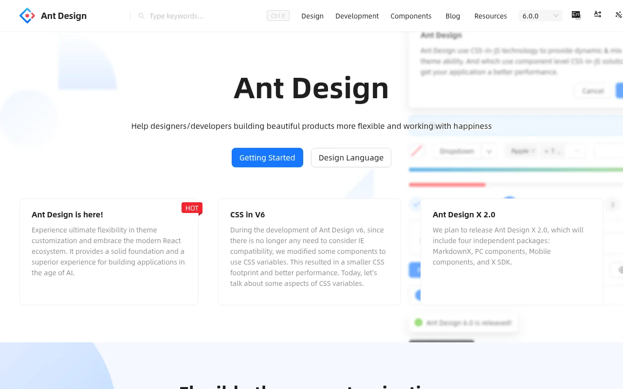
Ant Design is a React UI library designed for building high-quality, enterprise-level applications. It provides a comprehensive set of pre-built components, such as buttons, forms, tables, and layouts, adhering to a consistent design system. This allows developers to create visually appealing and functional user interfaces quickly, reducing development time and ensuring a cohesive user experience. Unlike other UI libraries that may offer fewer components or lack a strong design system, Ant Design emphasizes a polished, professional look and feel. It leverages React's component-based architecture and offers extensive customization options through theming and configuration. Developers benefit from its rich feature set, detailed documentation, and active community support, making it an ideal choice for complex web applications.
Ant Design 's Core features
Rich Component Library
Offers a comprehensive collection of UI components, including forms, tables, navigation, and feedback elements. This extensive library reduces the need to build components from scratch, accelerating development. The components are designed to be highly customizable, allowing developers to tailor them to specific project requirements. For example, the `Table` component supports features like pagination, sorting, and filtering, handling large datasets efficiently.
Consistent Design System
Provides a unified design language, ensuring a consistent look and feel across all components and applications. This design system includes predefined styles, color palettes, and typography, promoting a professional and cohesive user experience. The design system is based on Ant Design's principles, which emphasize usability and accessibility. This consistency reduces cognitive load for users and simplifies the design process for developers.
Theming and Customization
Enables extensive customization through theming options, allowing developers to adapt the UI to their brand's visual identity. Users can modify colors, fonts, and other design elements using a configuration file or by overriding CSS variables. This flexibility ensures that applications built with Ant Design can seamlessly integrate with existing branding guidelines. The theming system supports both global and component-level customization.
Internationalization (i18n) Support
Offers built-in support for internationalization, making it easy to create applications that support multiple languages. This feature includes localized components, date/time formatting, and text direction support. Developers can easily translate text strings and adapt the UI to different locales. Ant Design provides a robust i18n framework that simplifies the process of creating multilingual applications.
Accessibility Compliance
Prioritizes accessibility, ensuring that applications built with Ant Design are usable by people with disabilities. The components are designed with accessibility in mind, following WCAG guidelines. This includes features like keyboard navigation, ARIA attributes, and sufficient color contrast. This commitment to accessibility makes applications more inclusive and compliant with accessibility standards.
TypeScript Support
Provides full TypeScript support, enhancing code quality and developer productivity. TypeScript integration offers type checking, autocompletion, and refactoring capabilities, reducing errors and improving code maintainability. This support is available for all components and APIs, ensuring a seamless development experience for TypeScript users. This helps catch errors early and improves code readability.
How to use Ant Design
- Install Ant Design and its dependencies using npm or yarn:
npm install antdoryarn add antd.,2. Import the necessary components into your React component files:import { Button, Table } from 'antd';,3. Use the components within your JSX code, customizing them with props to fit your application's needs:<Button type="primary">Click me</Button>.,4. Import the Ant Design CSS styles in your main application file (e.g.,index.js):import 'antd/dist/antd.css';,5. Customize the theme by modifying the default variables or using a custom theme configuration file. This allows you to align the UI with your brand guidelines.,6. Refer to the official Ant Design documentation for detailed information on component usage, props, and customization options.
Use cases of Ant Design
Enterprise Application Development
Software engineers use Ant Design to rapidly build complex enterprise applications. They leverage pre-built components like tables, forms, and charts to create user interfaces with a consistent design. This accelerates development, reduces the need for custom UI elements, and ensures a professional look and feel for internal tools and customer-facing platforms.
Admin Panel Creation
Developers use Ant Design to create admin panels and dashboards. The library's components are well-suited for displaying data, managing users, and configuring settings. The consistent design system and theming options allow for a polished and branded admin interface, improving the user experience for administrators.
Internal Tooling
Teams building internal tools (e.g., CRM, project management) use Ant Design to create efficient and user-friendly interfaces. The library's components and design system help streamline the development process, allowing teams to focus on core functionality rather than UI design. This leads to faster development cycles and improved productivity.
Prototyping and Rapid Development
Designers and developers use Ant Design for rapid prototyping and quick application development. The extensive component library and ease of use enable them to quickly create interactive prototypes and functional applications. This allows for faster iteration and validation of design concepts before committing to full-scale development.
Who benefits from Ant Design
Frontend Developers
Frontend developers benefit from Ant Design's pre-built components and consistent design system, which accelerates development and reduces the need for custom UI implementations. It simplifies the creation of complex user interfaces, allowing developers to focus on application logic and functionality.
UI/UX Designers
UI/UX designers can leverage Ant Design's design system to create consistent and visually appealing user interfaces. The library's components and theming options allow designers to quickly prototype and implement their designs, ensuring a cohesive user experience across applications.
Enterprise Development Teams
Enterprise development teams benefit from Ant Design's robust feature set, scalability, and support for complex applications. The library's components and design system are well-suited for building large-scale, enterprise-grade applications with a professional look and feel.
React Developers
React developers can leverage Ant Design's component-based architecture and seamless integration with React to build interactive and dynamic user interfaces. The library's comprehensive documentation and active community provide ample resources for React developers of all skill levels.
Pricing of Ant Design
Open Source (MIT License). Free to use for commercial and personal projects. No paid plans or tiers.
