Material UI
React UI components for Material Design
Freemium
Support platforms
web
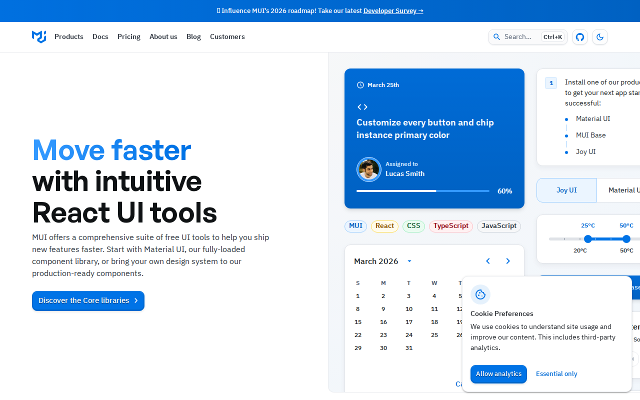
What is Material UI
Material UI provides a comprehensive set of React components for building user interfaces based on Google's Material Design guidelines. It offers pre-built, customizable components like buttons, forms, navigation, and more, streamlining the development process and ensuring a consistent look and feel across applications. Unlike other UI libraries, Material UI emphasizes accessibility, theming, and customization, allowing developers to easily adapt the components to their specific branding and design requirements. It leverages a component-based architecture, making it easy to integrate and maintain. Developers benefit from faster development cycles, improved UI consistency, and a focus on accessibility, making it ideal for projects of all sizes, from simple websites to complex web applications.
Material UI 's Core features
Rich Component Library
Offers a vast collection of pre-built, customizable React components, including buttons, inputs, navigation, and more. This accelerates development by providing ready-to-use UI elements, reducing the need to build components from scratch. The library supports theming and customization, allowing developers to adapt components to their specific design requirements, ensuring a consistent look and feel across the application.
Material Design Adherence
Implements Google's Material Design principles, ensuring a modern and consistent user interface. This adherence provides a familiar and intuitive user experience, as well as a visually appealing design. The components are designed to follow Material Design's guidelines for typography, color palettes, and interactive elements, resulting in a polished and professional look.
Theming and Customization
Provides robust theming capabilities, allowing developers to easily customize the appearance of components. This includes changing colors, typography, spacing, and more. The theming system is based on the `createTheme` function, enabling developers to create custom themes that align with their brand's design system. This flexibility ensures that the UI can be tailored to meet specific project requirements.
Accessibility Focus
Prioritizes accessibility, ensuring that components are usable by everyone, including individuals with disabilities. This includes features like ARIA attributes, keyboard navigation, and sufficient color contrast. Material UI components are designed to meet WCAG guidelines, making it easier to build accessible web applications. This focus on accessibility broadens the user base and improves the overall user experience.
Extensive Documentation
Offers comprehensive documentation with detailed explanations, code examples, and API references. This makes it easy for developers to learn how to use the components and customize them to their needs. The documentation includes interactive examples and guides, allowing developers to quickly understand and implement the components. This extensive documentation reduces the learning curve and accelerates development.
Community Support
Benefits from a large and active community, providing ample support and resources for developers. This includes forums, tutorials, and third-party integrations. The community contributes to the library's growth by providing feedback, bug fixes, and new features. This strong community support ensures that developers have access to the resources they need to succeed.
How to use Material UI
- Install Material UI and its peer dependencies:
npm install @mui/material @emotion/react @emotion/styled @mui/icons-material. 2. Import and use components in your React application:import Button from '@mui/material/Button';. 3. Customize the appearance using thesxprop for inline styling or create a custom theme. 4. Wrap your application with aThemeProviderfrom@mui/material/stylesto apply global theming. 5. Explore the extensive documentation and examples to learn about available components and customization options. 6. Utilize the Material UI Icons library for a consistent and visually appealing user interface.
Use cases of Material UI
E-commerce Website
A development team uses Material UI to build the front-end of an e-commerce website. They leverage pre-built components like product cards, shopping carts, and checkout forms, saving significant development time and ensuring a consistent user experience. The theming capabilities allow them to align the UI with the brand's visual identity.
Admin Dashboard
A company builds an admin dashboard for managing internal data. They utilize Material UI's components like tables, charts, and form controls to create an intuitive and efficient interface for administrators. The accessibility features ensure that the dashboard is usable by all team members, regardless of their abilities.
Web Application Prototype
A startup quickly prototypes a web application. They use Material UI to rapidly build a functional UI with minimal coding. The pre-built components and theming options allow them to create a polished prototype that accurately reflects their design vision, enabling them to gather user feedback and iterate quickly.
Internal Tooling
A large enterprise develops internal tools for various departments. They choose Material UI to ensure a consistent look and feel across all tools, improving usability and reducing training time. The library's accessibility features ensure compliance with internal accessibility standards, promoting inclusivity.
Who benefits from Material UI
Frontend Developers
Frontend developers benefit from Material UI's pre-built components and theming capabilities, which accelerate development and reduce the need to write custom UI code. This allows them to focus on application logic and user experience, leading to faster project completion and improved productivity.
UI/UX Designers
UI/UX designers can use Material UI to quickly translate their designs into functional prototypes. The library's adherence to Material Design principles ensures that the UI aligns with established design patterns, making it easier to create user-friendly and visually appealing interfaces.
Web Development Teams
Web development teams benefit from Material UI's consistency and maintainability. The component-based architecture and theming system simplify code management and ensure a uniform look and feel across projects. This reduces the risk of design inconsistencies and improves collaboration among team members.
React Developers
React developers can leverage Material UI's React components to build user interfaces efficiently. The library's integration with React makes it easy to incorporate UI elements into React applications, simplifying the development process and improving code readability.
Pricing of Material UI
Material UI is open-source (MIT License). Offers a free core library. Premium and Pro plans are available with additional features, components, and support. Pricing details are available on the official website.