React Bits
Animated React UI Components
免费
支持平台
web
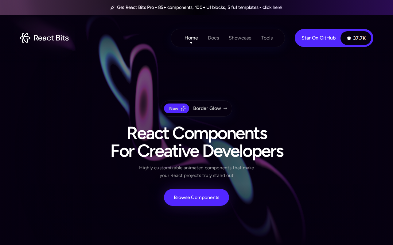
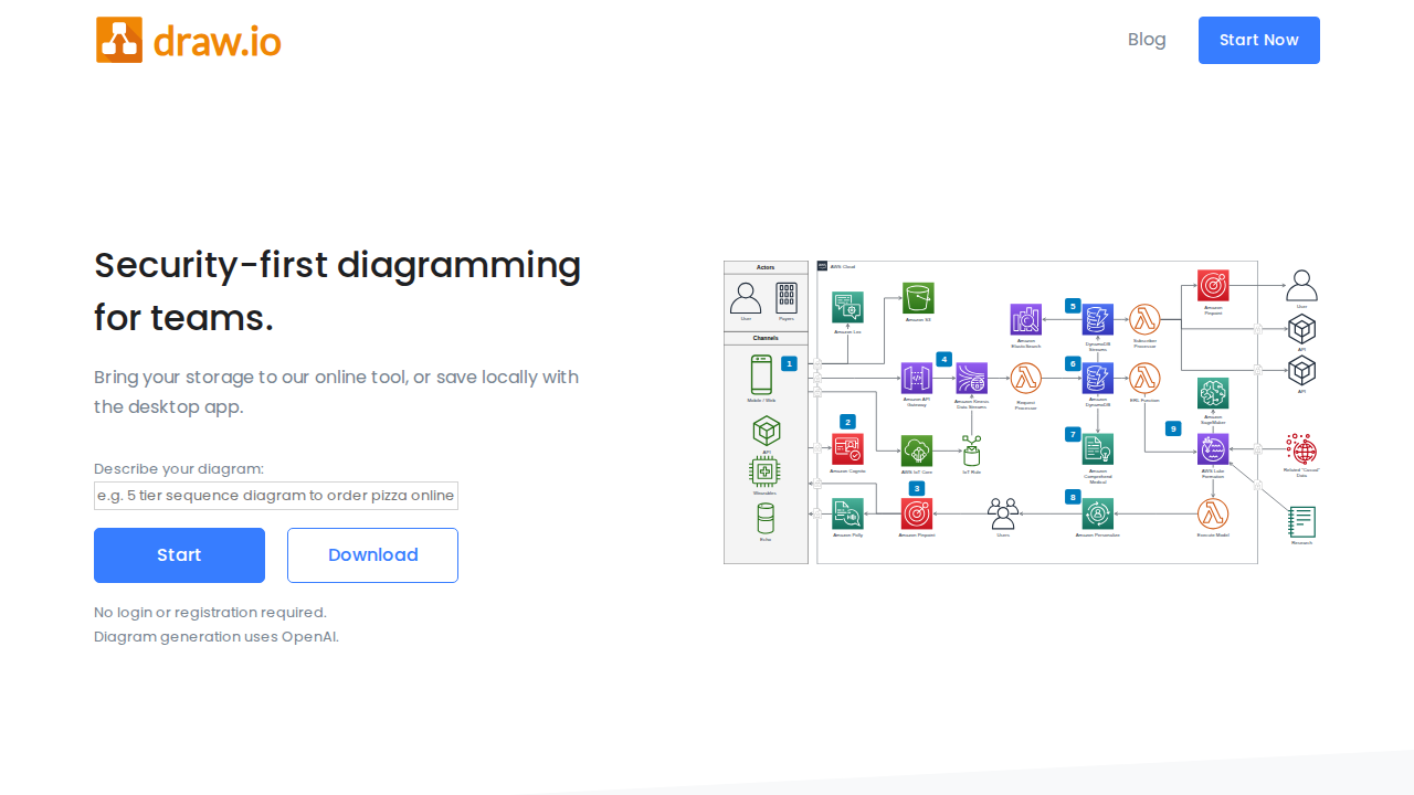
什么是 React Bits
React Bits is an open-source collection of high-quality, animated, and interactive React components designed to help developers build stunning and memorable user interfaces. It provides a curated set of customizable components, offering a streamlined approach to adding engaging animations and interactive elements to React projects. Unlike generic UI libraries, React Bits focuses on animation and interactivity, providing a specialized toolset. It leverages React's component-based architecture for easy integration and customization, making it ideal for developers seeking to enhance user engagement and visual appeal in their applications. Developers, designers, and frontend engineers benefit most from React Bits, particularly those working on web applications requiring rich UI/UX.
React Bits 的核心功能
Animated UI Components
React Bits offers a library of pre-built, animated UI components, such as buttons, loaders, and transitions. These components are built using React and CSS animations, providing smooth and engaging visual effects. This saves developers time and effort compared to building animations from scratch, leading to a more polished user experience. For example, a button component might include a subtle hover animation using CSS transitions, improving user feedback.
Interactive Component Library
Beyond animations, React Bits provides interactive components that respond to user actions. These include components like interactive sliders, toggles, and form elements. The components are designed to be fully customizable, allowing developers to tailor their appearance and behavior to match the specific needs of their projects. This interactive design enhances user engagement and provides a more dynamic user experience.
Customizable Props
Each component in React Bits is designed with a set of customizable props. These props allow developers to control the appearance, behavior, and animation of the components. This flexibility means that developers can easily adapt the components to fit their project's design system and branding. For example, a button component might have props for color, size, and animation duration.
Open Source and Free
React Bits is an open-source project, available under an open-source license, allowing developers to use, modify, and distribute the components freely. This open-source nature fosters community contributions and ensures the components are continuously improved and maintained. The MIT license allows for commercial use, making it accessible for a wide range of projects.
React-Based Implementation
Built entirely with React, React Bits components seamlessly integrate into existing React projects. This allows developers to leverage their existing React knowledge and skills. The component-based architecture of React allows for easy integration, reusability, and maintainability. This simplifies the development process and reduces the learning curve for developers already familiar with React.
High-Quality Code and Design
React Bits components are designed with a focus on code quality and visual appeal. The code is well-structured, documented, and follows best practices. The designs are modern and visually appealing, ensuring that the components enhance the overall user experience. This focus on quality helps developers create professional-looking and performant user interfaces.
如何使用 React Bits
- Visit the React Bits website (reactbits.dev) to explore the available components and their demos.,2. Choose the component you want to use and examine its code examples and customization options.,3. Install the necessary dependencies using npm or yarn:
npm install react-bitsoryarn add react-bits.,4. Import the desired component into your React project:import { ComponentName } from 'react-bits';,5. Integrate the component into your JSX code, customizing its props to match your design requirements.,6. Test the component within your application to ensure it functions as expected and meets your UI/UX goals.
React Bits 的使用场景
Enhancing Web App UI
A frontend developer building a web application can use React Bits to add animated buttons, loaders, and transitions, improving the visual appeal and user experience. They can customize the components' appearance to match the application's branding, resulting in a more polished and engaging interface. This leads to increased user engagement and a more professional look and feel.
Creating Interactive Forms
A designer working on a data entry form can use React Bits' interactive components, such as sliders and toggles, to create a more engaging and user-friendly form experience. They can customize the components' behavior and appearance to fit the form's design, leading to improved user satisfaction and data entry accuracy. This results in a better user experience.
Building Dynamic Dashboards
A developer building a dashboard application can use React Bits to add animated charts, graphs, and other interactive elements. They can customize the components to display data dynamically, creating a more engaging and informative dashboard. This enhances data visualization and improves user comprehension of key metrics.
Prototyping UI/UX Designs
A UI/UX designer can use React Bits to quickly prototype interactive user interfaces. They can integrate the pre-built components into their prototypes, saving time and effort compared to building components from scratch. This allows them to test and refine their designs more efficiently, leading to better user experiences.
谁适合使用 React Bits
Frontend Developers
Frontend developers benefit from React Bits by gaining access to pre-built, customizable, and animated React components. This saves them time and effort in building UI elements from scratch, allowing them to focus on core application logic and improve the overall user experience of their web applications.
UI/UX Designers
UI/UX designers can use React Bits to quickly prototype and implement interactive UI elements. The library provides a range of customizable components that can be easily integrated into designs, allowing designers to create more engaging and user-friendly interfaces without extensive coding.
Web Application Developers
Web application developers can leverage React Bits to enhance the visual appeal and interactivity of their applications. The library offers a collection of animated and interactive components that can be easily integrated into existing projects, improving user engagement and overall application quality.
React Bits 的价格方案
Open Source (MIT License). Free to use, modify, and distribute for commercial and personal projects.